I particularly like how the designer has considered the best way to engage the audience through using a combination of text and image here, although I am not sure about the use of colour.

Source
I feel as though this has a much more obvious link to sugar cane and it's uses and think the use of different shades of green works well to produce a striking infographic. I will certainly take inspiration from this when I start designing my own work.

Source
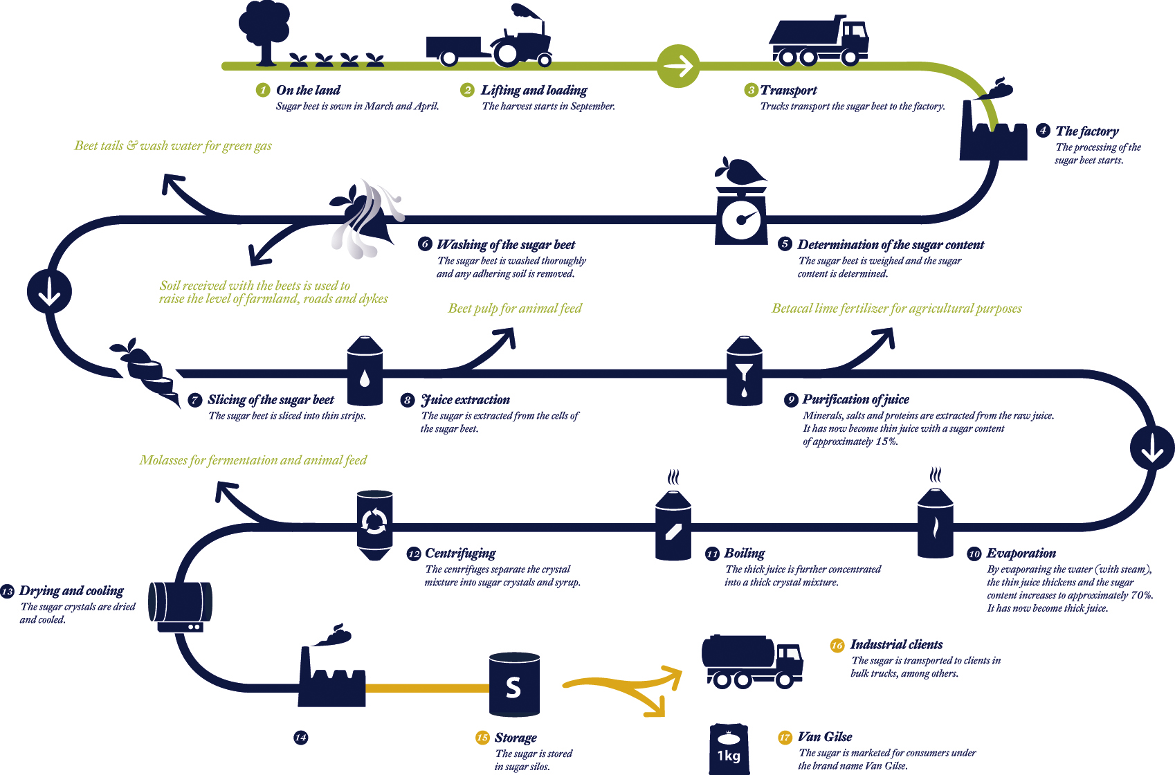
This is another one I particularly like, as it is formal but I also feel as though it has an element of friendliness, to help people to understand as easily as possible. The way the line curves round continually to illustrate the journey could be applied more directly to sugar cane by perhaps using the shape and form of sugar cane itself.

Source
I feel as though this infographic may be slightly too text heavy. I think if I was to produce work for web with an infographic element to it, I would strongly consider how to keep the text separate from the images, by perhaps having it so that the user has to click on the image to reveal the relevant text.

Source
Looking at this has definitely helped me to decide that I should avoid gradients in my work. I have never really liked applying them to my work as it is, but I think on screen especially it is unnecessary.
No comments:
Post a Comment