Thursday 28 February 2013

OUGD406 - InDesign Brief Secondary Research: Rhino

Below are images of the Sumatran Rhino which is becoming more and more endangered.


Sumatran Rhino
Dicerorhinus sumatrensis

Dicerorhinus from the Greek word meaning two; cero meaning horn; rhinus meaning nose. Sumatrenis referring to Sumatra its home.

Population: 300
Weight: 600 – 950kg
Length: 2.0 – 2.3m
Habitat: Dense tropical rainforest, mainly in the Malay Peninsula on the Indonesian islands of Sumatra and Borneo.
Eastern 50
Western 250

The Sumatran, known as the hairy Rhino because of its long shaggy hair unlike other species which appear hairless, is a descendent of the Woolly Rhino.

Unlike White Rhinos Sumatran rhinos are browsers feeding on young saplings, leaves, mangoes, bamboo, twigs, figs and bark. When feeding, the animal moves in a zig-zag pattern, sampling the potential food items in sight before it takes in mouthful qualities.

Status: The Sumatran, the smallest living Rhino, has been a critically endangered species for at least 30 years. Today as few as 300 are left in the wild.

The main threat to the Sumatran rhinoceros is habitat destruction. Human activities from logging and land clearing for agriculture has lead to them losing their homes. Land clearing has made entry into the once remote forest homes of these secretive creatures easier. Poachers then kill the animals for the “alleged” magical properties of its horn and other body parts. The incentive for poachers is very high when rhino horn is worth 10 times its weight in gold on the black market.

The Woolly Rhino was on earth during the ice age, 350,000 years ago. Its whole body was covered with thick and shaggy coat which helped them survive in very cold climates. The Sumatran Rhino is the last representative of the Woolly rhino family.

The Sumatran Rhino (Dicerorhinus sumatrensis), is the smallest living rhinoceros. Over the past years, its habitat has shrunk to several isolated areas due to poaching. In Sumatra and on the Malaysian Peninsula the Western Sumatran Rhino (Dicerorhinus sumatrensis sumatrensis) can be found, represented by 150 animals in Sumatra and not more than 100 of the continental population. The Eastern Sumatran Rhino (Dicerorhinus sumatrensis harrisoni), an inhabitant of Borneo, was still widespread at the beginning of the 20th century. Today fewer than 50 individuals survive.

Rhino Project

Rhino conservation: In 1995 the Sumatran Tiger Trust, in search of the critically endangered Sumatran Tiger, laid the first remote cameras in Way Kambas National Park, Sumatra. More than tigers were photographed: A healthy population of one of the rarest animals on earth was found – between 12-24 Sumatran Rhino. Sumatran or “hairy rhinos” are probably the most endangered of all the rhino species with fewer than 300 left in the wild. In 1996 Rhino Protection Units, funded by International Thino Foundation, were introduced and their goal? Conservation of those rhinos and their habitat. The core rhino and core tiger habitat in way Kambas does overlap. In 2003 the rhino and tiger protection units joined forces. There are 7 units now operating in Way Kambas to provide more effective and efficient protection.

There is an anti-poaching patrol in action deep in the heart of the National Park. Armed for protection from illegal intruders these men suffer intense heat, humidity, insects, wet clothes and boots and a multitude of other things and yet have a deep personal commitment to protecting the heritage of Sumatra for the future.

South Lakes Animal Park currently fully fund 9 anti-poaching patrols of five men in each patrol, working in the forests.

£4.00 Pays 1 Sumatran Park Ranger for the day.
£38.00 Pays 1 Poaching team for the day.
£250.00 Pays for the whole project to run for the day.
£1, 460 Pays for 1 Sumatran park Ranger for the year.
£15, 000 Pays for 1 Anti Poaching team for a year.


OUGD406 - InDesign Brief Primary Research: Rhino

These are all of the Rhino photographs I took at South Lakes zoo. Unfortunately the Rhinos didn't ever come close enough to get some good close up shots but I am happy with the outcome of the ones I did manage to get and will definitely use them for my work.


Tuesday 26 February 2013

OUGD404 - Design Principles: Health Leaflets

Phil asked us to collect some health leaflets. I went to the doctors surgery and picked up as many as I could possibly find. We were asked to look at the grid systems used on each leaflet and when doing so we were asked to draw on all of the different grids we could see. I therefore scanned all of my leaflets in to the computer and illustrated where the grids were by using the ruler tool.

When doing this task I noticed that all of the health leaflets had a certain structure to them. This is because the information provided is extremely important and has a serious tone to it. If the information was scattered and not in any kind of order it would imply that it has an informal, fun tone to it. I found this task really interesting and it made me realise just how many different grids there are out there, making it easy to apply to work.


OUGD404 - Design Principles: Construction of Grids

Before you can apply a grid you must understand the requirement of the grid for the work to be produced.

Typeface, text and illustrations, print method and paper quality must be confirmed beforehand (ideally).

Always start with small sketches...

Thumbnail sketches will make your job of final layouts easier and productive.

Thumbnail sizes should be proportionate to the final format.

...To make your job of final layouts easier and productive.

Before drawing your sketches, consider the number of columns needed.

For example...

  • 1 column only for text and illustrations gives the little freedom of layout
  • Restriction of making illustrations small, medium or large
  • 2 columns, logically gives you more scope: 1 column for text, 1 column for illustration, they can be mixed together
  • 2 column division can be subdivided to create a 4 column page
Three columns
  • Opportunities for arranging and accommodating text and illustrations in numerous sizes
Disadvantages pf 6 columns are
  • Lines of text will be narrow
  • Small typeface will have to be used
  • But... this solely rests on the function that is to be performed
For statistics, figures, graphs and trend line publications use 4 columns per page

Remember 4 columns can be subdivided into 8, 16

The width of a  column dictates the size of typeface used.

The rule
  • The narrower a column is the smaller the typeface
Thumbnails and developments

Make a variety of thumbnails of layouts/designs
Do not rely on just one set of thumbnails
Enlarge a small selection of appropriate thumbnails by 1:1
Compare them and select and repeat process until you are confident with the design

The first line must fit flush to the top limit of the column grid
The last line must stand on the bottom limit
Keep calm, it is difficult to find the final solution the first time around
It could mean that your grid field is too high or too low

1:1 thumbnail type area with the depth and breadth that fits best both functionally and aesthetically
Divide into further 2 or 3 text columns
Divide the text column into 2 or 3 fields

Font Heights

Caption text:
4 point type
6 point leading

Header and footer text:
7 point type
10 point leading

Body text:
10 point type
13 point leading

Headline:
40 point type

Subheading:
20 point type

Type and picture

(8 field grid)

A4+ format
8 and 20 grid fields
8 grid fields are used frequently for advertising material and brochures
If using 8 field grids, you can subdivide into 16 grid fields
8 and 16 grid fields give you a range of possibilities

8 grid fields allow various sizes of illustrations to be portrayed
You can use with or without text
You need to have a good perception of composition

The grid is only an instrument in which you, a designer, can make interesting and balanced designs

20 field grid has quite a large scope for idea solutions
There is around 42 possible layout options

Experimenting with layout and grids in inDesign...


Sunday 24 February 2013

OUGD406 - Communication Is A Virus: Further Research (Cups)

As I am in charge of looking at and designing cups for this brief I thought it would be helpful for me to look online to see if there are any relevant and inspiring designs.
 
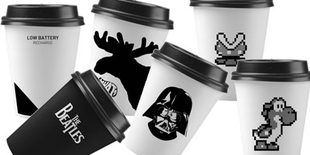
Although I am not keen on the graphics on this design I think the white cup and black lid looks very sophisticated, however for us, it depends on cost and availability and I can imagine if we tried to get white cups with red lids of desired shade it would be expensive and very much a case of trial and error. 
  Cool-Cups1.jpg
 

I love these coasters. I think if we were to create coasters it would be great, however I don't think they are necessary for us, as people probably wouldn't use them. The only way they would use them is if they were a collectors item and souvenir for our project, where all of the proceeds of course would go towards Comic Relief.
 
SANDWICH COASTERS
 
 
This is a really effective way of keeping hot drinks hot, I like the design of the packaging as it is functional and fun at the same time. I definitely feel as though it is important for us to provide lids with our cups as it maintains heat as well as reducing the amount of spillages.
 
Put A Lid On It
 

This is such a clever concept, especially for graphic designers, although I couldn't really take much inspiration from this directly, I think there are ways I could indirectly, for example by taking the idea of having something to read on the inside of the cup and perhaps having it on the bottom of the cup instead, as it wouldn't be possible for us to produce so many cups with designs printed on the inside, unless we were to spend a lot of money.
 
MYCUPPA MUGS
 
 
Similarly, the designer here has considered the audience a lot. I feel as though for our Comic Relief tea containers, they need to be bright and encourage people to buy. They also need to be in some way informative so that the consumer knows what they are buying and where the proceeds are going to.
 
2 CARAT CUP
 
 
Another innovative way of creating a coaster, fun and creative whilst maintaining simplicity too.
 
SPLAT STAN COASTER
 
 
If we had the funds to create something like this it would be amazing, as we could develop upon this design and possibly create a lid with a red nose on it. They would be designed so that people could keep them and remember the event in years to come. Unfortunately this isn't feesable but it is a great concept.
 
Decole : Chocolat Cake...
 
Source

Decole : Little Red...

Source

Decole : Gingerbread...

Source

By having the indiviual illustrations on each mug here, it personalises it. I think that in our case this would be slightly hard to do maybe, but we could apply the idea effectively by having different flavoured tea illustrated in a fun way.

Kawaii mug cup from Decole Japan!

Source

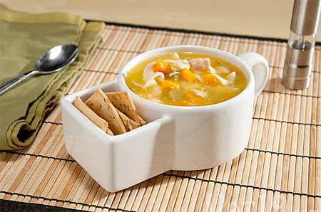
I think this is really clever and could possibly be achievable, but maybe not with plastic or polystyrene cups as it would be unstable to use.

Soup and Crackers Mug

Source

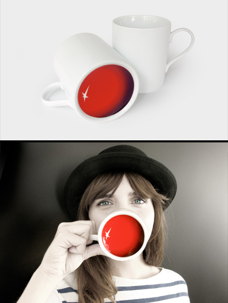
This is obviously the most relevant design relating so closely to what we are doing. We can definitely use this as inspiration, and I think even if I create something which can be placed on the bottom of the cup, whether it is text or image, will be very effective.

Clown Nose Mug

Source