Having found other useful blogs and websites with inspirational work on, I still find that the one blog which inspires me the most is Mr Cup. Fabien Barral uses this blog to document all of his personal work as well as his commissioned work. I find that I always love his use of typography, colour and illustrations. He manages to gel all three together to create unique and intricate designs. For this brief in particular I have experimented with a variety of ways to present my recipe cards to the students, I feel as though I want to create something which is easy to store, easy to handle and professional. I think it is important to demonstrate to the year group what is expected of us in first year, and just how achievable things are, without scaring them and making them feel worried.
Although this isn't a design which I would do, I think it is relevant to what I am doing because I am trying to create a practical storage solution for my recipe cards. A simple folder like this would be manageable and neat, and there would be enough room to store everything I need to inside.

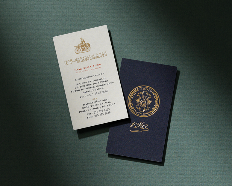
This is a really mature, professional design. I love the use of gold for their logo as well as how they have incorporated it in their business cards. It makes them striking and memorable. I feel as though I could certainly take inspiration from this design for this brief, as I could experiment with foiling. However this just depends on the printing technique I use, as I would have to use a laser printer for it to be successful. The placemat is particularly inspiring to me, and I would like to see what it would look like if I was to design one myself, however I don't think, from asking people, students would actually use them.
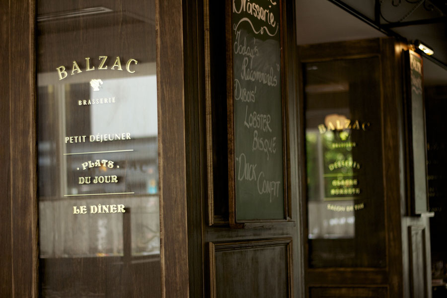

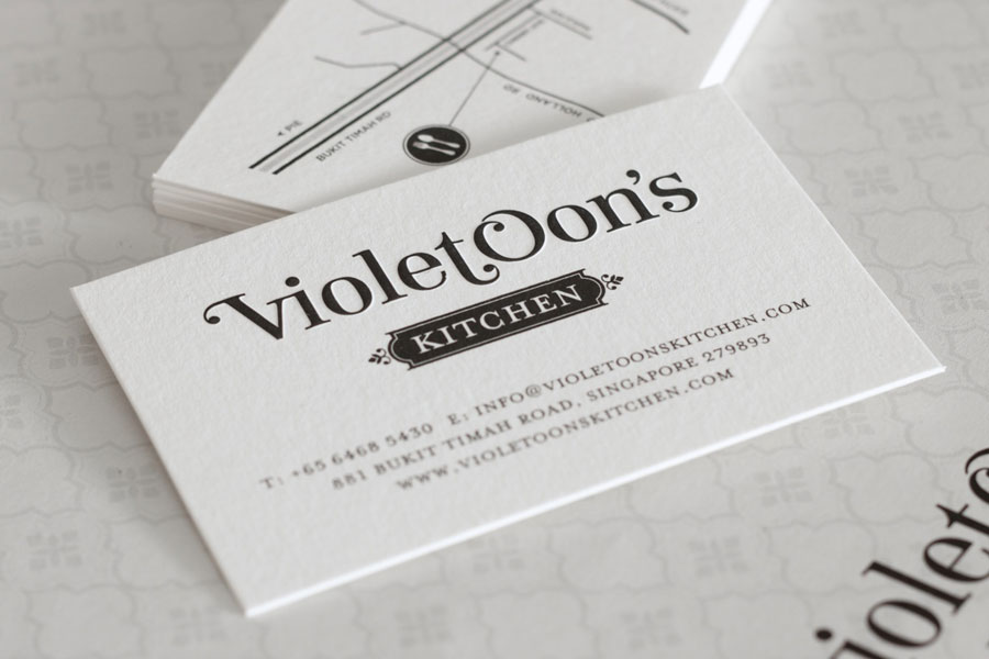
I love the fonts which have been used here and I feel as though they work really well together. They are slightly playful but at the same time convey the necessary message and advertise the place in a very stylish manner. The use of black plus stock makes it simple and allows the design to be clean and professional. As I usually use sans serif fonts I feel it is important for me to develop in this area and experiment with using a more decorative, perhaps script font for this brief.


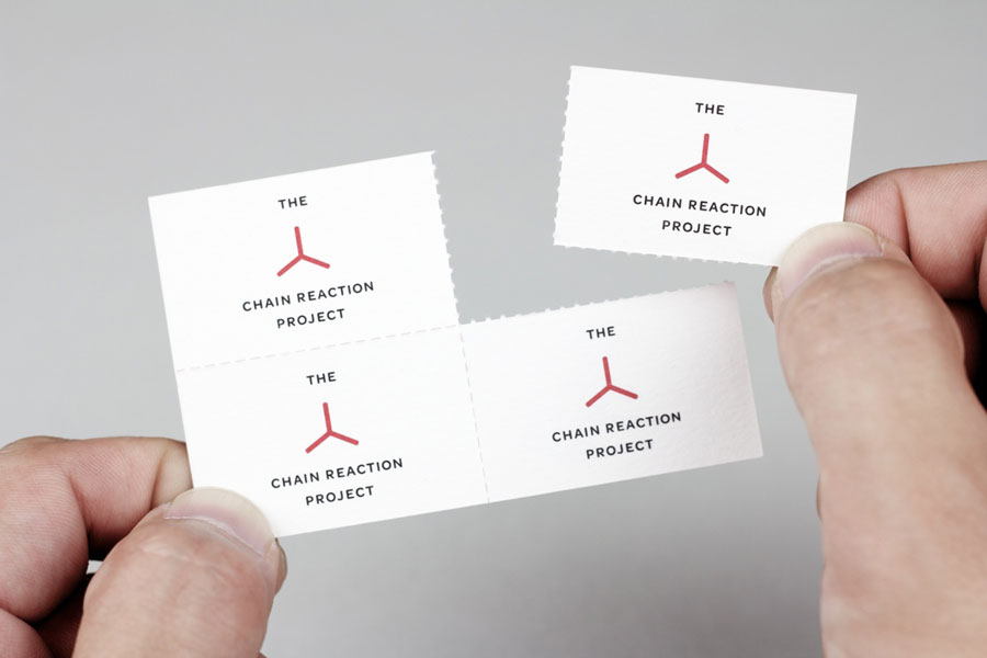
I saw this and instantly thought it related closely to my work. I had considered perforating my recipe cards so that they could be torn off to send home, however this would leave the student with an uneven edge and also nowhere to store the recipe cards once they have been filled in. If I was creating a business card and branding my product, then this would definitely be a technique I would consider, however I am not branding it because I feel it is unnecessary for this brief, and I want to make it as personal as possible.
I like how this design is versatile enough to be applicable to a variety of products. If I could create a pattern which could be printed on most of my products successfully, I would be able to create a consistent pack for the students.
I seem to be drawn to very illustrative designs at the moment, whether it is because I want to improve upon my drawing skills and have therefore been subconsciously looking for inspirational work I don't know, but this design in particular stood out to me. I feel as though by creating hand rendered work, it makes work unique and personal and I would love to achieve this for this brief.
I think this is a really creative and inspiring piece of design. I love how all of the books have a simple illustration on the front with lots of negative space around it, it draws the eye to the one illustration and makes it stand out as being a dominant feature of the design.
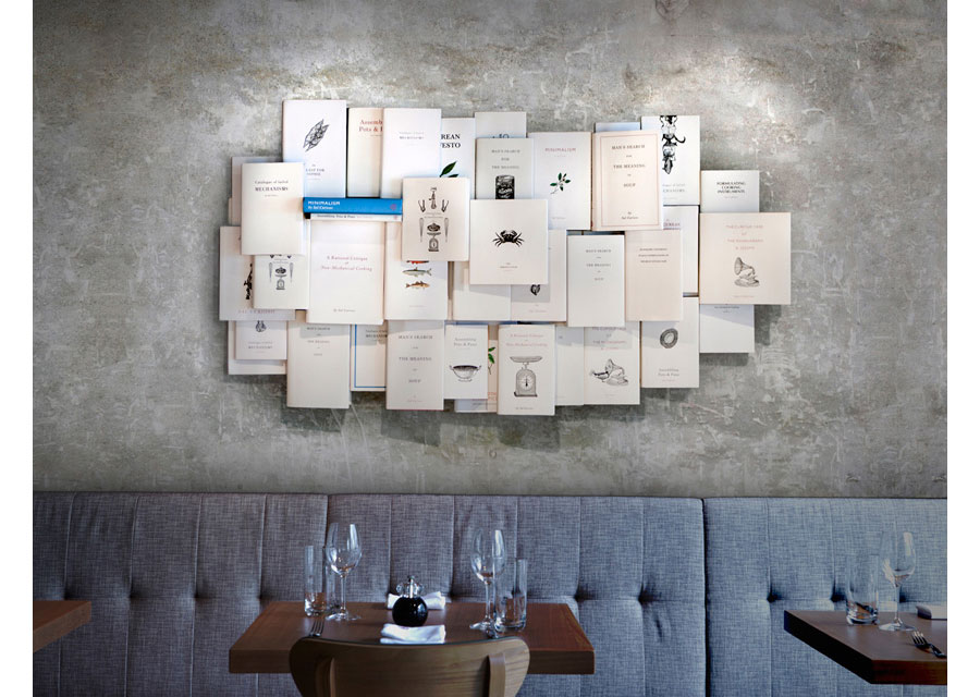
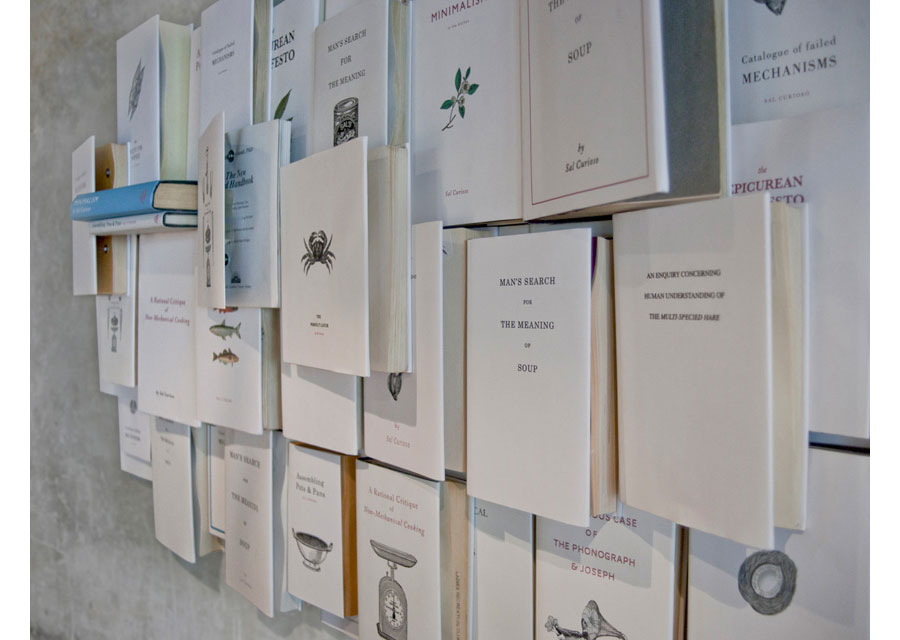
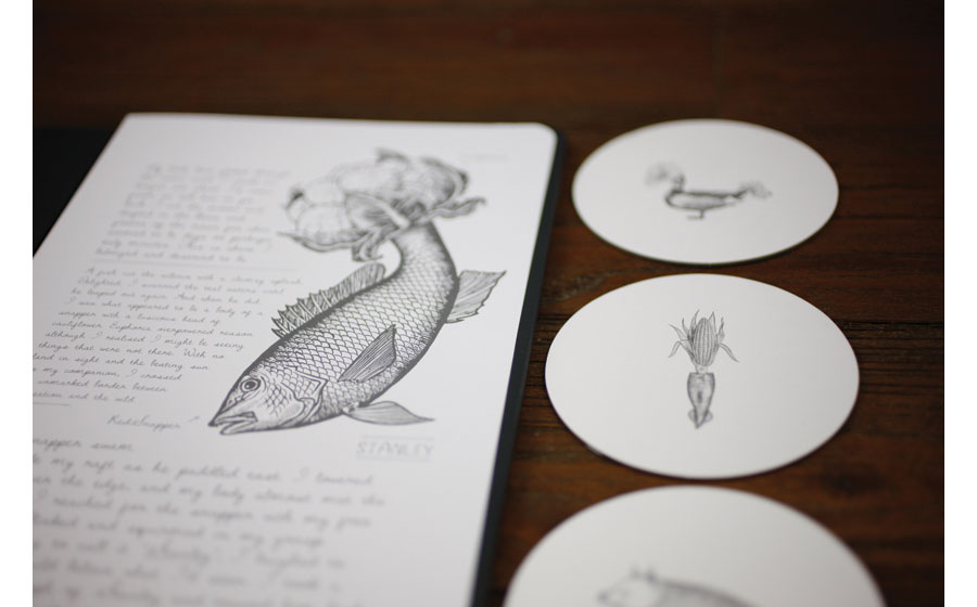
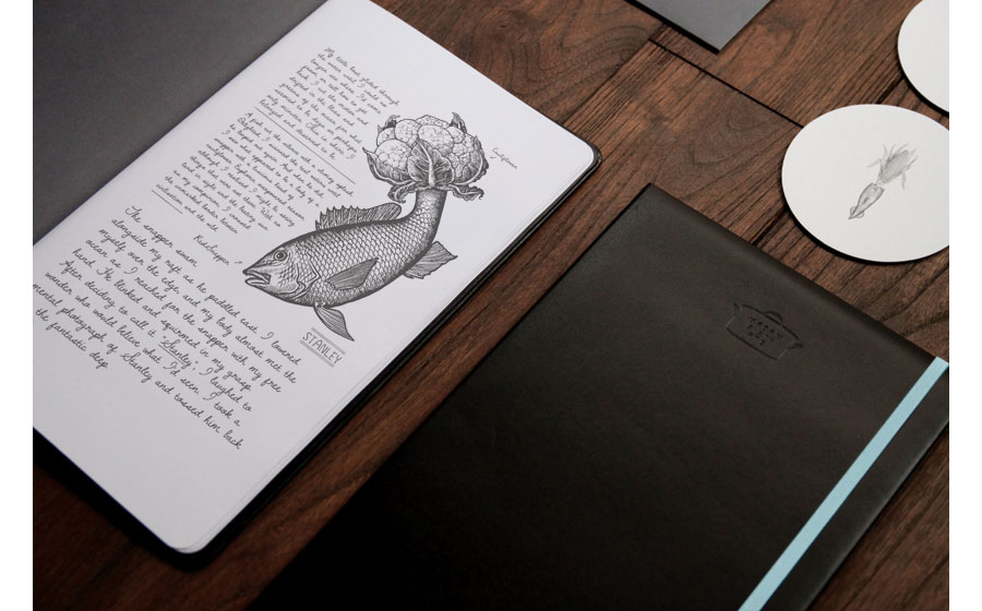
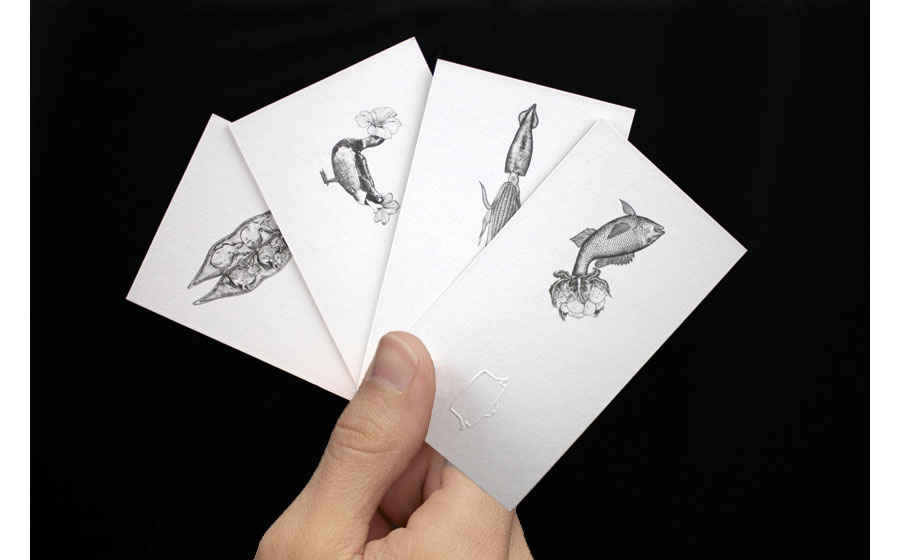
Here, the designs have been successfully been applied to coasters too, I think they work really well and they give the coasters that extra bit of detail, supplying the design with a memorable illustration. I particularly love the fine detail within all of these drawings too. I will most certainly take inspiration from this work when designing my final recipe cards.
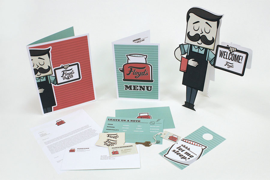
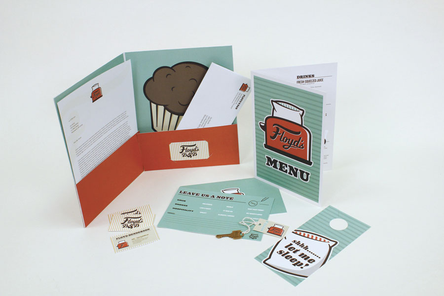
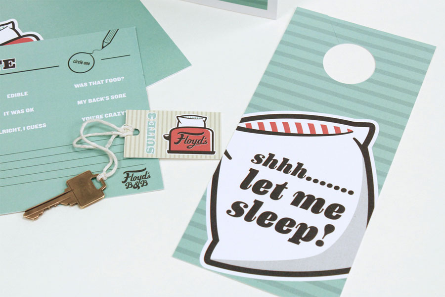
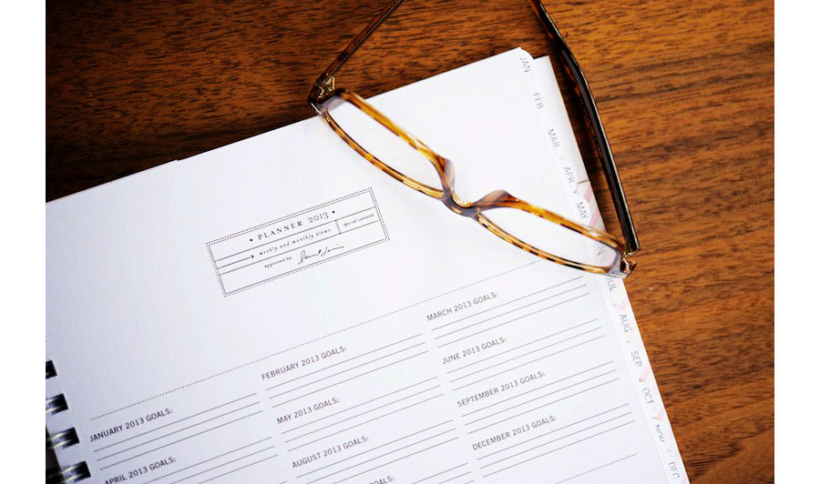
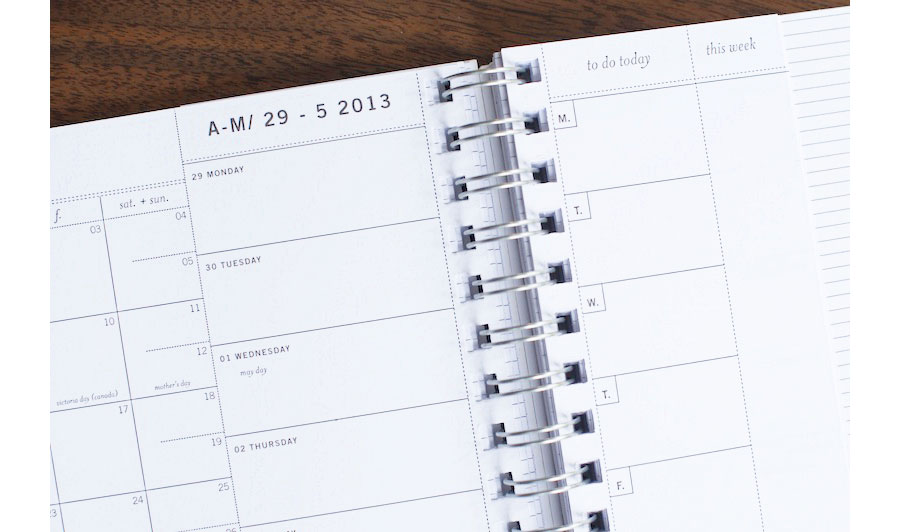
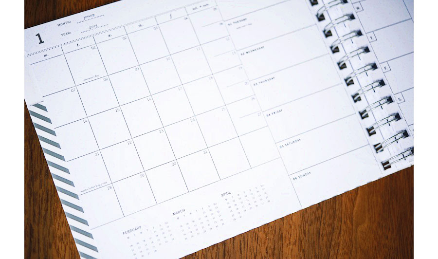
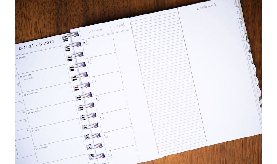
As I am going to be creating recipe cards for students to fill in and send home, I thought this design was very fitting and in close relation to my work. The cover, works really well as it has a full pattern with a certain area dedicated to the heading and text. The inside is very functional and has all the space you would need to write anything down. These are all things I will consider when creating my recipe cards as well as shopping list cards. It is important not to get too carried away with imagery and pattern all of the time, as it can detract and become too busy if it applied too much to a design.
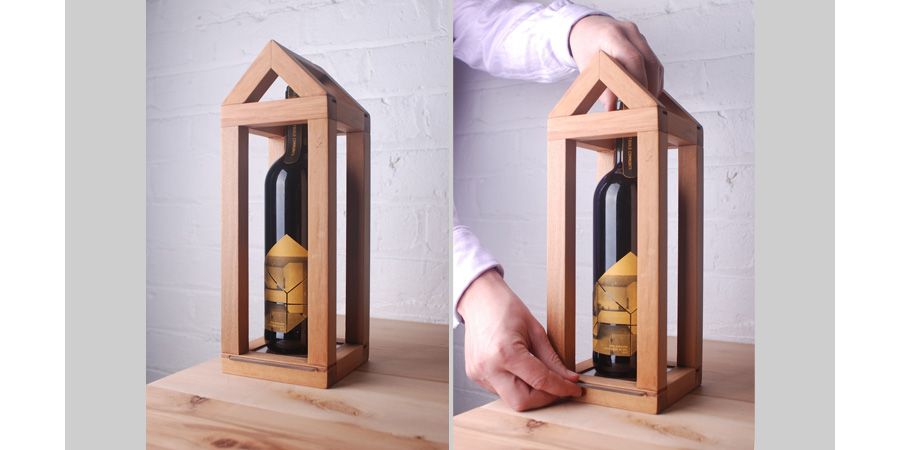
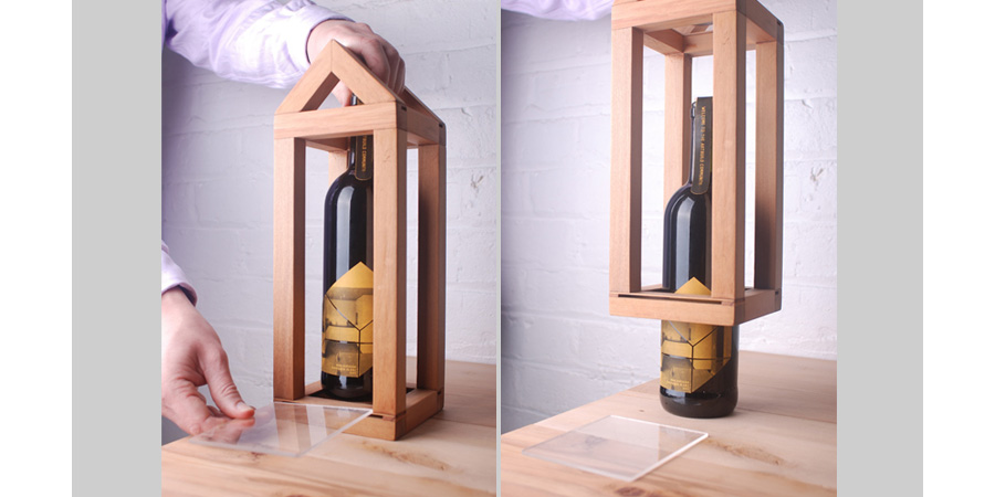
This caught my eye as soon as I saw it because it reminds me of my initial idea of creating packaging for the recipe cards in the shape of a house. In this case, it packages the bottle of wine really successfully and works as a functional as well as attractive piece of design.
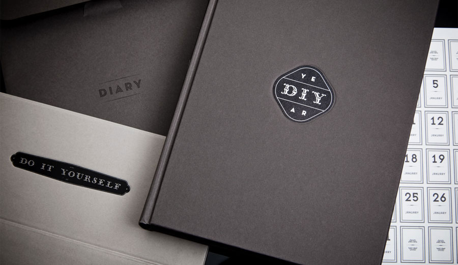
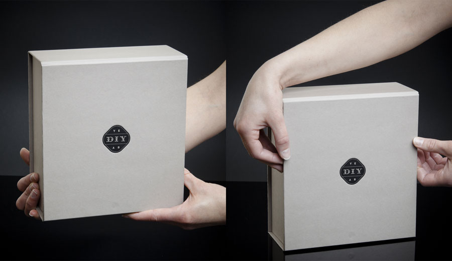
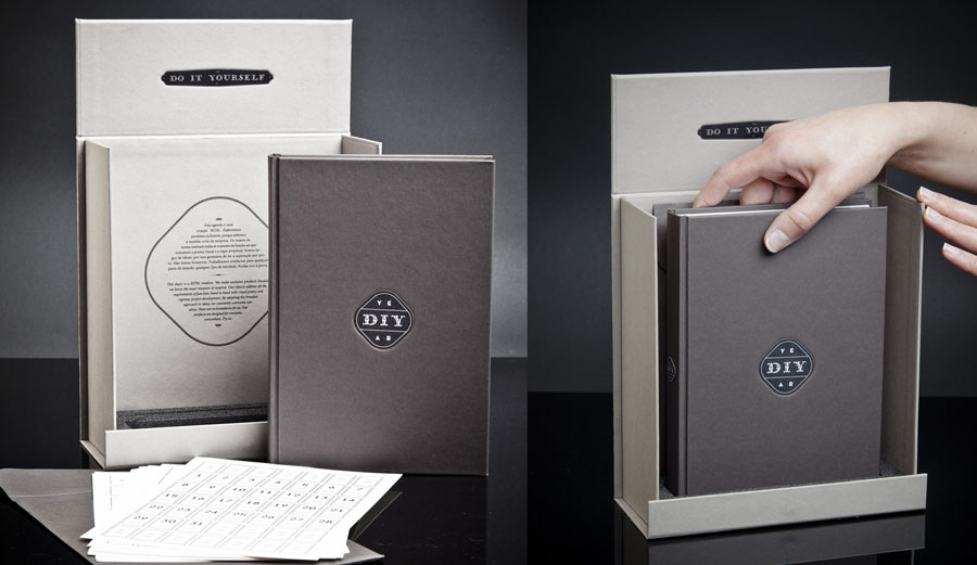
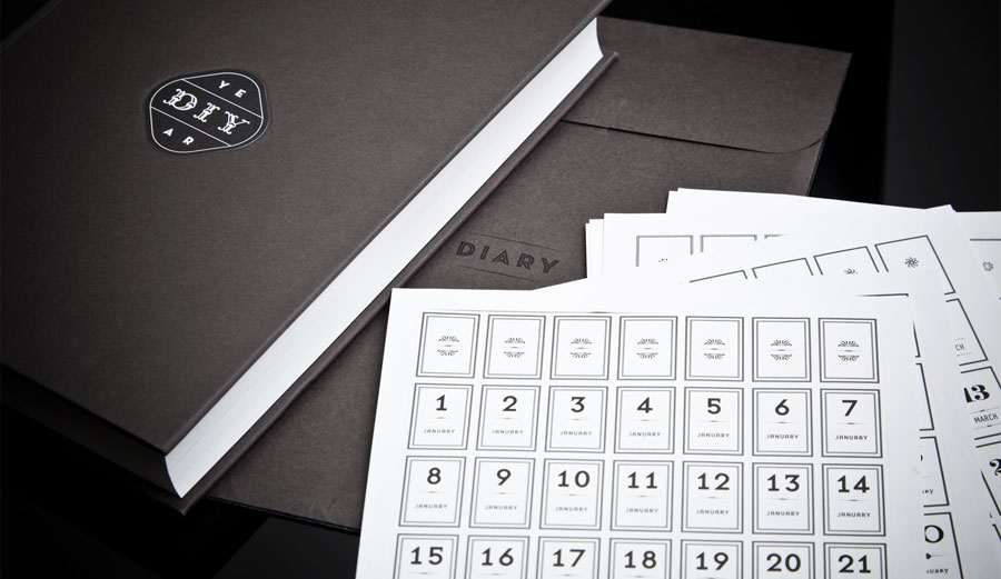
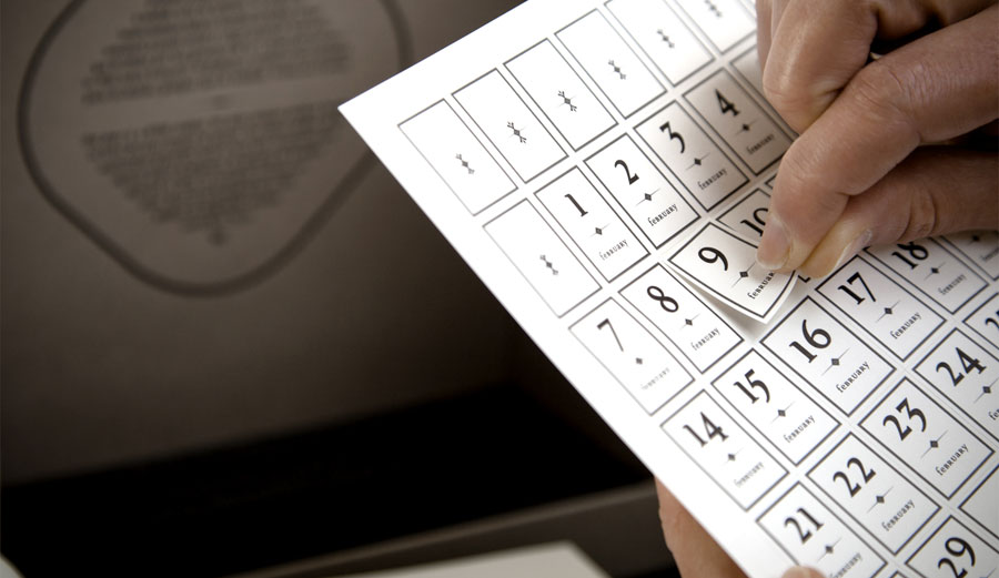
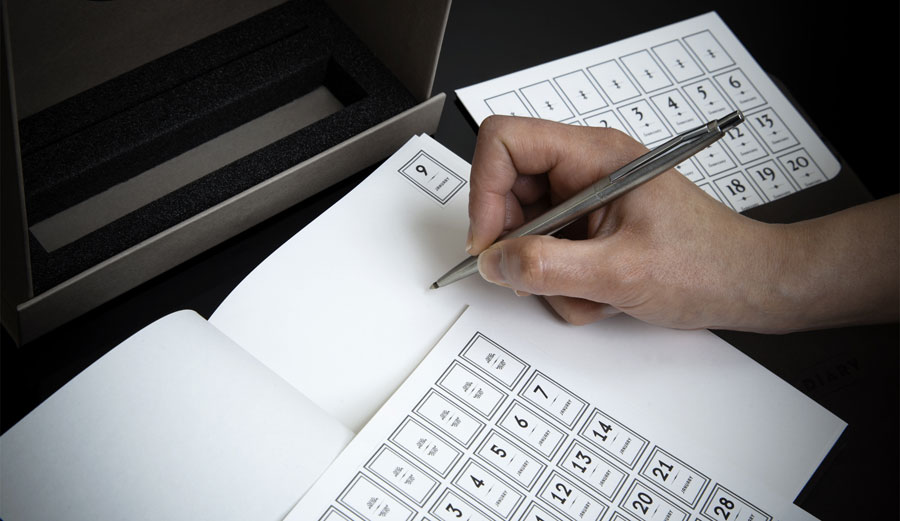
I had already blogged this a while ago, and when I had decided to design stickers for tupperware containers I instantly thought back to this design. It is a do it yourself diary whereby you use the stickers to mark out each day. I think the way the stickers have been presented is inspiring in itself as they are functional, attractive, and fit into the container well. These are all things I need to consider when designing my own.
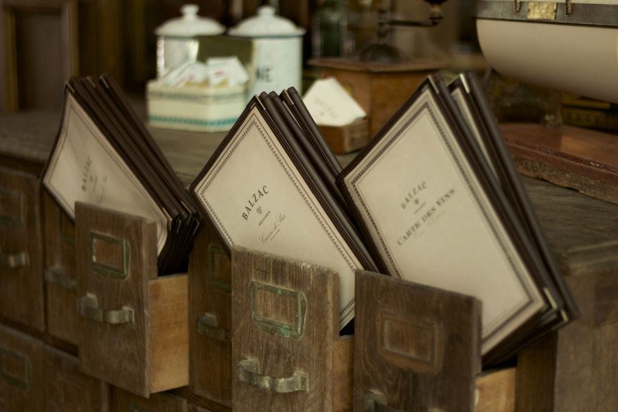
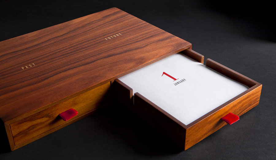
If I was to concentrate more on the container for the recipe cards in terms of having it as something which could be stored in the bedroom and look striking too, I would consider designing drawers similar to this. I would have one draw for recipes already printed and another one with black ones in. In my case however it is more important that I look at how to make the recipes easy to use as well as protected from dirt and grease, which is why I feel that laminating them would be the best option.
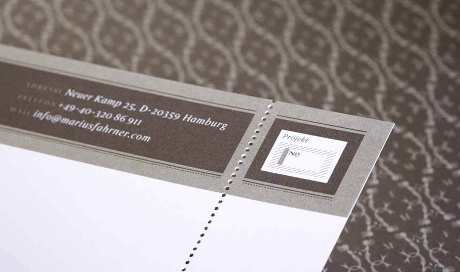
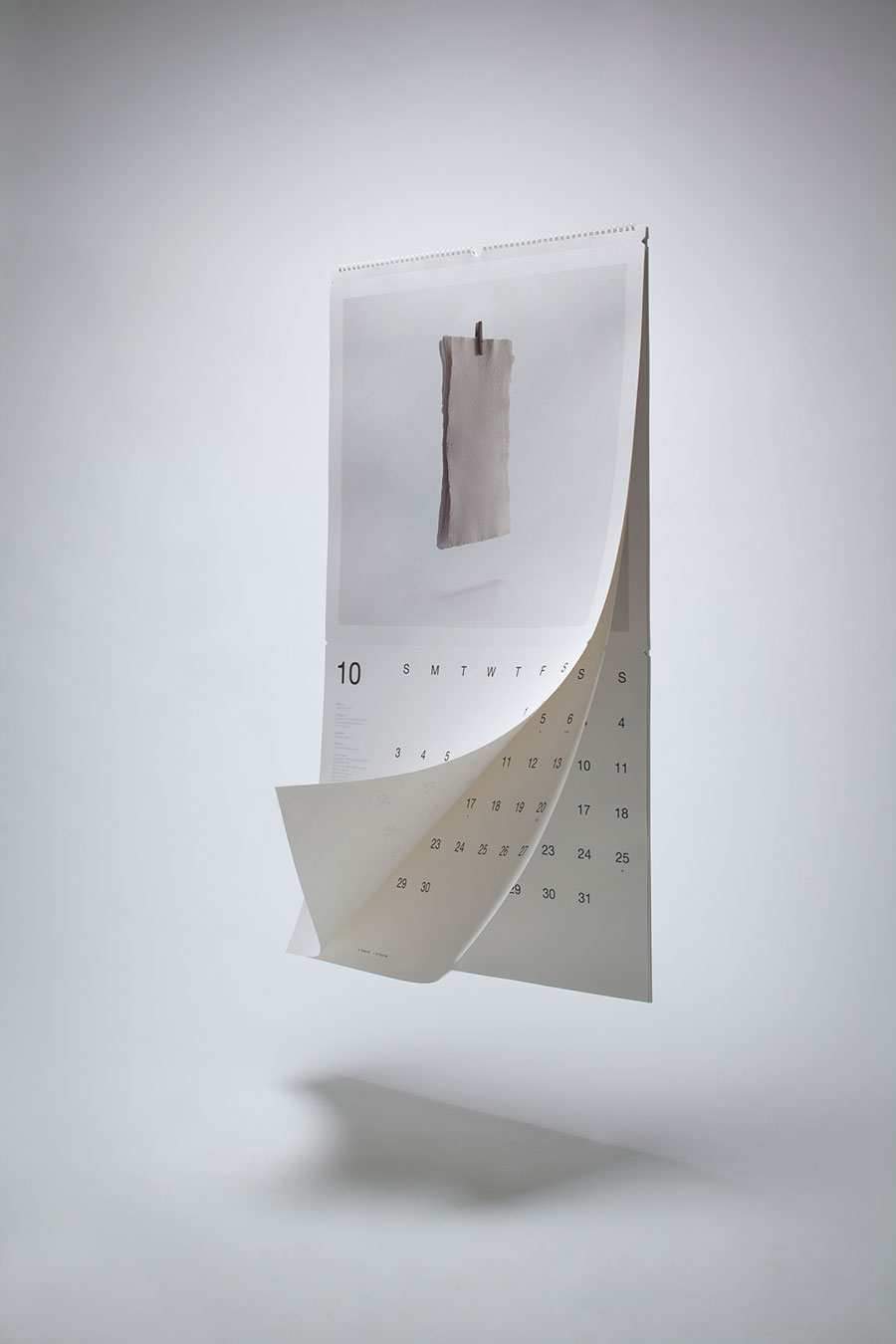
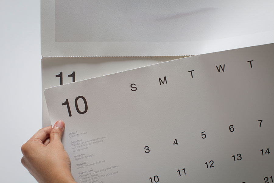
By having a perforated edge like this, it would mean that the students could tear off the stamp and keep the recipe card alone. I love this idea and think it is very practical, however I also like the idea of having the stamp as a part of the design to make it more personal and authentic.
This is a publication I came across which gave me the idea to supply the students with pens and pencils for them to use to fill in the cards. However the more I consider this idea, the more unnecessary it seems, as all students have their own pens, and being graphic design students will probably have a preferred pen to use. Therefore it wouldn't be worthwhile buying pens or pencils at a reasonable price when they may have their own, favourite ones to use.
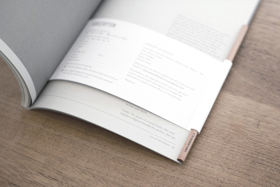
The concept of having a piece of paper on the inside which is designed to hold the pencil is extremely inventive and practical as it would always be with the necessary materials and so would be a functional accessory.
The black print against the off white stock here works really well. Once again a perforated edge has been incorporated in the design, however I still don't feel as though this would be necessary to me.
When starting to consider the range of ways I could store the recipe cards I became more aware of existing design whilst browsing the internet. This is very similar to the desired appearance of my own work. The use of the clipboard gives it an authentic feel and also means that the recipes could be used one by one. However, an issue with this is that they may get dirty, damaged or lost.
This is a much simpler, more functional way of standing the recipe cards up. However I am still unsure as to whether it is necessary for them to stand up, as they could be harder to view as opposed to having them flat against the worktop. I will however be experimenting with this before coming to a final conclusion.
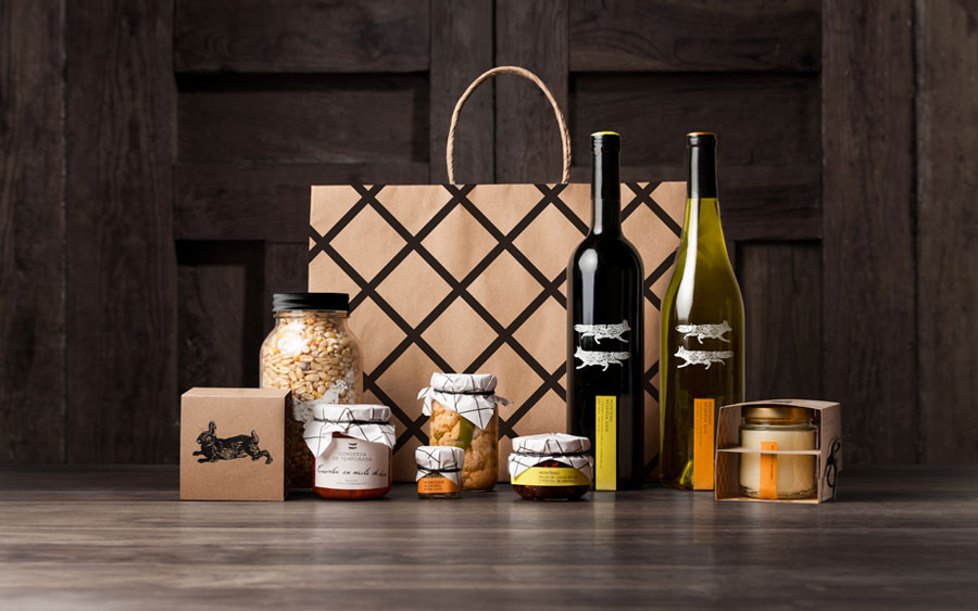
This brown bag gave me the idea of having a pin board like design for my recipes to be stored. Where the lines cross over, this would be ribbon or string, leaving room behind each one to keep a recipe card. This is a much more personal way of storing them, and perhaps more feminine too. I think it would be suitable if I was to create something for a specific type of person, but I don't think it is suitable for this brief.
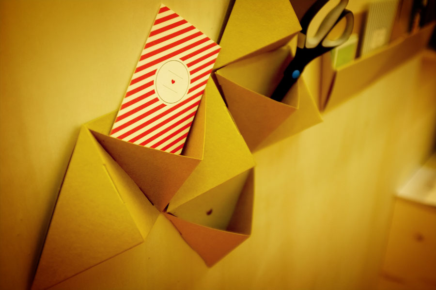
I saw this and instantly thought it was an innovative way of storing things, in this case equipment and materials. The students would need to have the necessary wall space to hang this on, and therefore it may not be completely appropriate. It would also be hard for me to make it easy to store away too, and it may not be very sturdy depending on the materials I use.
I think this is a very professional, stylish storage option, but perhaps too sophisticated for my audience and the purpose of my recipe cards. I don't want them to be presented too formally and therefore need to think of a fun, yet functional way of storing them.
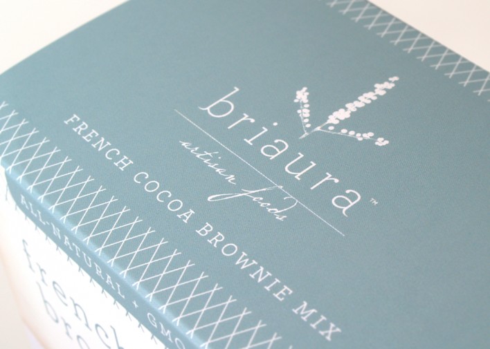
The thing that caught my eye most about this design was the use of colour and also the fact that it is a brownie mix and therefore packaging relating to food and recipes. I think it is really well balanced and the design is extremely attractive to look at, I would certainly want to see how the products inside had been presented. This is the exact same effect I want to have on the students. The outer packaging therefore needs to be enticing and inviting.
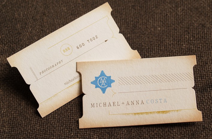
I found this inspirational because of the way it looks worn out and as a result authentic and traditional. This is a look I could go for, but I think if I was to definitely consider cleanliness and maintaining the quality of my designs, it would defeat the object to include recipe cards which already look half worn out already.
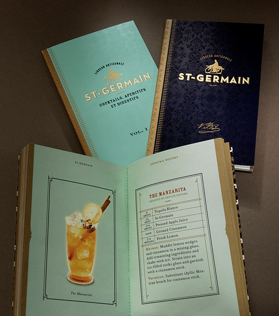
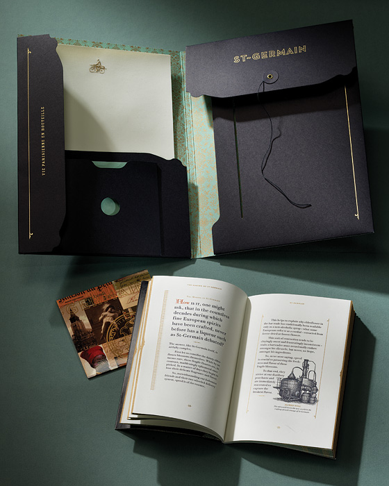
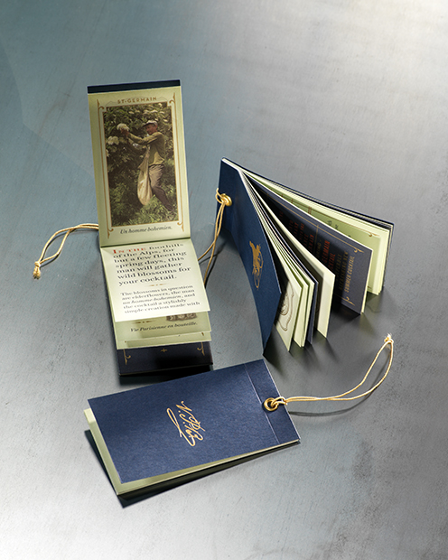
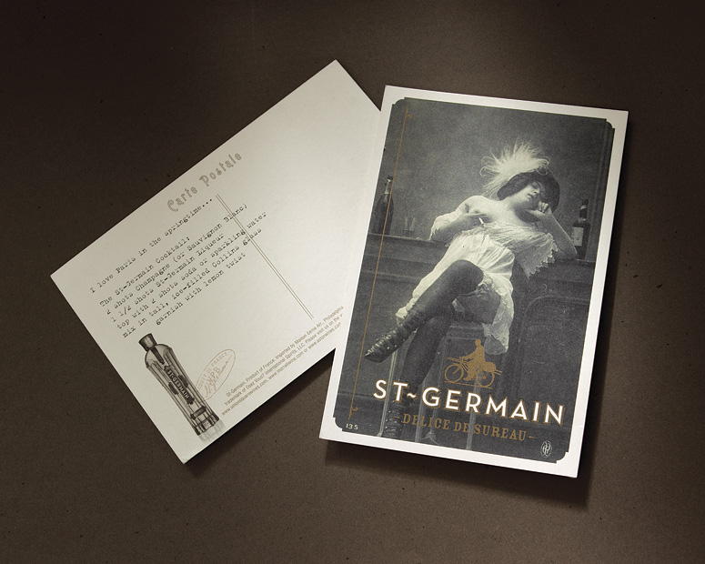
All of this Saint Germain work is very striking. The use of colours is the main thing which stood out to me, and the presentation of the recipes themselves are very inspiring and informative. I will definitely take this on board when designing mine.
Source