
Below are some images of publications I found online. I have posted all of the ones I found inspiring for my Vogue publication. I found this one particularly inspiring as I had an initial idea in mind for my publication which involved somehow incorporating the history of International Vogue. I thought I could possibly take the outlines of the relevant countries and place information inside. I quite like this example as the colour scheme works well and looks professional. I wouldn't want to overcrowd my publication in terms of colour and want it to be as simple and organised as possible so that it is easy to follow.


Source


When designing my publication I need to consider how it will be composed. This will involve not only setting out each page but it will also involve considering how it will be put together. By creating a simple standard book publication it would be quite boring and not very creative. This is why I need to try and make it as interesting as possible and as interactive as possible. The example I found below considers all of these things and I really like how it has been brought together with the use of a well crafted box and a ribbon to seal it.
I quite like the idea of having a piece of card overlaying the rest of the book with another version of the cover illustration on it. It is a simple yet quirky way of giving it a unique added dimension. I may consider this when I start the design process for my publication.

This reminded me in some ways of Vogue with the bold serif font and the striking imagery. This would work within my publication, however I don't want to be simply using the existing photography and embedding it into my work as is isn't very challenging.


I found this pop up calendar online and thought it was well constructed. This gave me the idea to start looking at pop up books and the formation of different publications. I think the chosen colours work well together and it looks professional and smart whilst at the same time being informative.

I came across this when I started searching for 3 dimensional books. I thought it was really clever the way that the artist had carved out of the book to form a face. This is certainly something I could look at doing, however it would mean using an existing publication and altering it, therefore meaning I would have to be extremely confident when forming the desired carving, otherwise it would be a waste of a book. I would therefore have to do a lot of practice prototypes first.

This caught my eye as I think it is clever how the pop up is embedded in to the article or information on the pages. It stands out and is a helpful way of remembering relevant and interesting information.

I had an idea of somehow constructing Vogue House within a publication. I thought about creating it out of paper and then having individual doors inside containing information about my chosen topic. This image below shows just how hard it would be to successfully make a detailed house, with things inside it. I wouldn't be creating something as complicated as this but I will definitely take inspiration from it if this is the direction I choose to take eventually.

This doesn't really relate to my publication as such, but I think it is really well done. Is it statemental yet simple at the same time. It is monochromatic which is definitely reflects my preferred way of working and I think it is striking and memorable.

I found this online and absolutely love it. I think it very closely relates to what I want to do in terms of it linking to fashion and an existing magazine - Harper's Bazaar. It is a limited edition publication they released which as pop up features inside.


I think this is really clever and would love to make something similar myself, it makes it feel a bit more realistic and involves the reader a bit more than a standard book would as the creator of the magazine has tried to make it as interactive as possible.

I love this, just because it is quite obscure and out of the ordinary. For this reason it makes it memorable and I think something like this would be fun to create, by using old Vogue magazines and collaging different parts throughout the publication.

This would be particularly hard to construct as it has so many different intricate parts to it. I think it would be really satisfying being able to achieve this though and would love to master the art of being able to do something like this.

This is a stylish and unique publication for Lady Gaga. I like how the text on the front is off centre and it is all neutral tones. The typeface also works really well and it is enticing, making you want to open it and find out more.


I quite like how the designer has decided to bring lots of photographs together as well as some digital work to create a collage such as the one shown below. It is quite abstract and different yet it works quite well.

This image below is extremely strange and out of the ordinary but it still works to represent Lady Gaga as she is quite eccentric. I could maybe take inspiration from this work by taking some of my Vogue magazines and scanning them in to create different textures to be used in the backgrounds of my publication.


As I am considering creating something which is pop up or 3 dimensional in some way, I feel as though this relates closely to what I am doing, and I will be able to take inspiration from it for my work. I think it has been very cleverly designed and produced.


Below is a video of the design, showing how each page is set out and how it works as a publication. If I could create something interactive like this, I feel as though I will feel happy and content with myself.
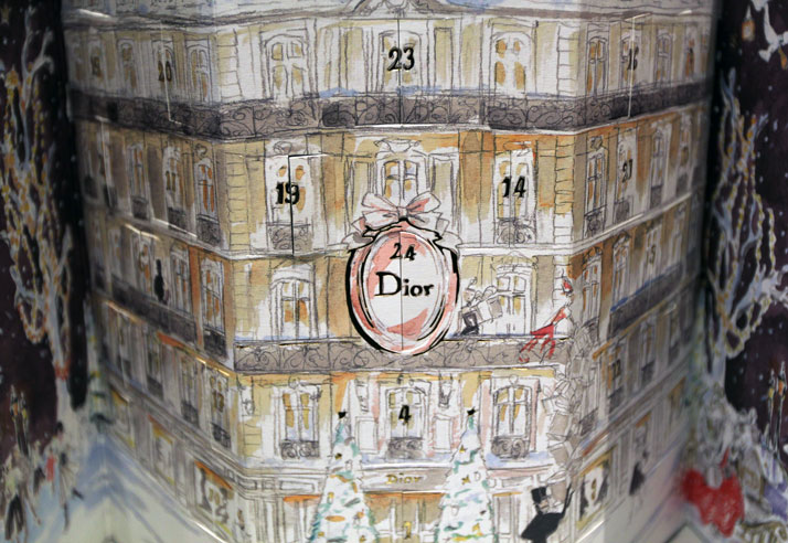
I found this Dior pop up house which has been designed. It is an advent calendar, and has given me the idea of creating a house with doors to different eras. I love how this has been designed, and if I was more confident with using water colours I would probably try and recreate this idea. However, it wouldn't be original if I did this.
These are some intricately detailed, and very well crafted pop up buildings which are designed to open with a simple page folded in half. This is definitely something I will take into consideration when designing my own work, as I feel it has a strong structure and will work well to maintain a stable 3 dimensional publication.


I like the simplicity of this black and white design, I feel as though it is striking, attractive and easy to follow, as there are particular illustrations and areas for text on each page, making it easy to read without there being too much going on at once.


I love how innovative and individual this packaging is. Is is very fitting to the books found inside and the colours work well for the nature settings found within the books. I also like how the inside is interactive and involves the reader having to pull certain tabs to make them move.


This involves having to wear the 3 dimensional glasses to be able to view all of the images on each page. I like this idea and think it is a clever way of making a publication memorable.

Source
This is another minimal, clever way of presenting information, whilst including 3 dimensional parts to each of the individual pages. I think I will definitely take inspiration from this, and will try to create something similar in terms of it being clean and simplistic.


Although I am not very keen on the actual design of this, I like the concept behind it. The idea of having pockets on the inside with things to lift out is clever and interactive and I think it would encourage someone to pick it up and read it.


Source
I absolutely love this design. It is so illustrative and classy at the same time. It looks as though it would have been very time consuming to produce and the person who designed it must have had lots of patience.


I found this and thought it related to the idea of me create a Vogue publication. Although mine won't look like this, I think I will definitely be able to take inspiration from it.


Source
I really like how everything is contained within a box here. It makes the design compact and functional. Everything inside is useful and informative too.


Source
I think if I was to create a standard publication with simple pages I would lay it out in a similar way to this design. I like how clean the pages are and think the imagery stands out as being really striking. This is something I could work with with Vogue as there are a lot of images I could use.


Source
This is another well crafted and creative design to store a range of different items. The designer has considered the audience, considered how the content will fit inside, and also considered the colour scheme closely so that it relates to the subject matter.


Source
This is clever, as someone has packaged themselves in a can essentially, rather than creating a standard CV which doesn't stand out as much.


Source
As we are looking at a brief history of something, in my case Vogue, I think it would be ideal to include some sort of visual timeline to inform people about the history. I like how the images here are enlarged with a small amount of text next to each one, this is something I will consider when designing my own work.


Source
It is quite self explanatory as to why this links with what I am doing, as once again there are 3 dimensional images found on each page. This would be something I could consider creating, however it will only make it more about the packaging rather than the content.


This made me think about creating a a folder which can be stored on shelving and could have cards inside about Vogue.

Source
No comments:
Post a Comment