Below are some examples of work taken from Behance advertising McDonald's in different ways. Some pieces of work show McDonald's in a good way and some are a little bit more controversial. There are quite a few projects which I came across, however I have just posted some which I feel are relevant to my developmental decisions and ones which I find influential.
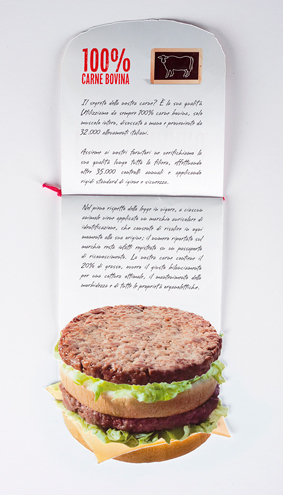
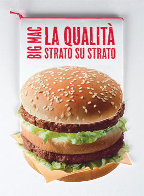
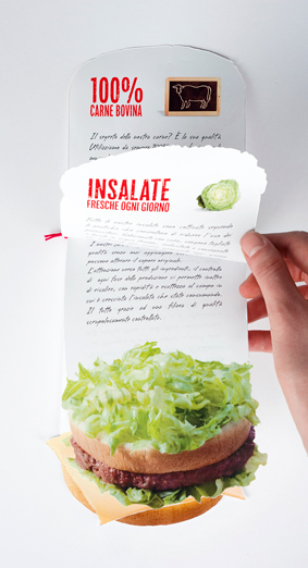
I really like the design of the leaflet below, with each layer representing a different part of the burger. This is a clever way of communicating the ingredients in an interesting way.
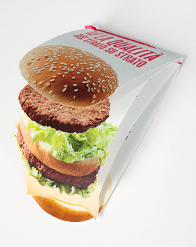
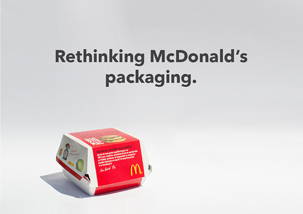
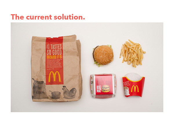
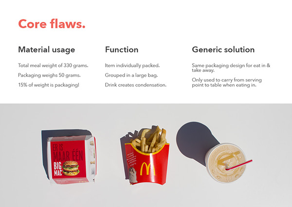
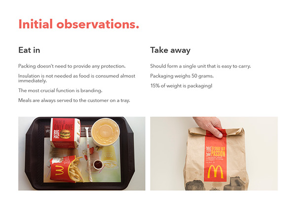
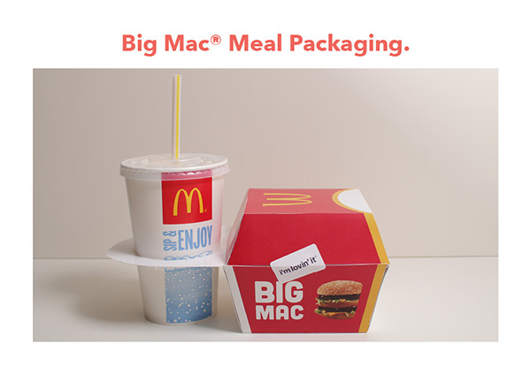
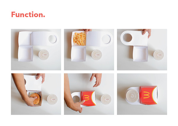
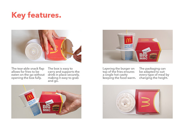
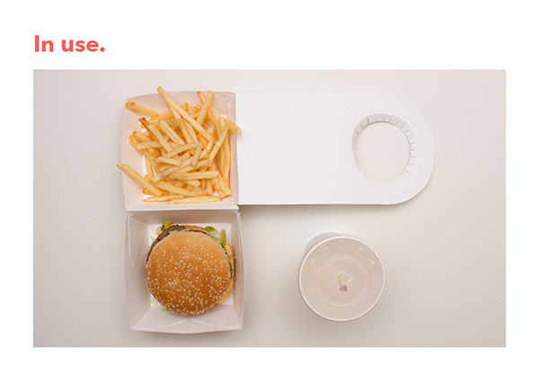
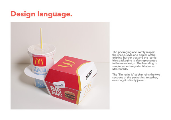
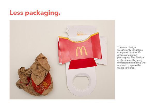
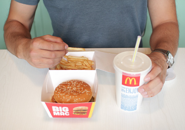
This is an example of some packaging which I thought was quite creative and relevant to my essay in terms of reducing the amount of packaging multinational companies use for their products.
I think the poster design below paints quite a positive picture for McDonald's, illustrating that they use 100% potato in their chips. I think the image itself is powerful enough alone and doesn't need much supporting text.
I thought this design was extremely clever and inventive. Although it isn't something which I can take inspiration from for this brief, it is something which I can refer back to.





No comments:
Post a Comment