This packaging was designed by Elmwood studios. I think it works really well to represent aromatherapy and would love to create something of such high standard. I feel as though mine should have a bit more of a vintage feel to it however, to represent the history of the Chateau de Versailles.
The design agency was briefed to design a luxurious brand which would primarily appeal to the high-end, affluent, female market but also a visual identity that would create attention amongst a wider audience.
The indigo blue black bottles have been designed as a product range for men and women. The Therapie logo encompasses the initial ‘T’ with the products’ links with nature in the shape of a butterfly – representing natural transformation and the restorative qualities of the range, according to Greenwich.
The products have been designed to be easy to navigate, with each item in the range being represented with a different colour butterfly and using a clean, white uppercase font to clearly depict the individual product names.

" I designed a set of perfume bottles along with a box of perfume vials. This set of perfume packages are inspired by the Victorian cabinet of curiosities. Each go the illustrations on the back of the label relates to the aromatherapy of the scent. The jasmine + sandalwood fragrance is to increase romance. The bottle features an anatomical heart illustration. The rosemary + bergamot fragrance is blended to improve metal clarity. The bottle features a brain illustration. The eucalyptus + lemon fragrance is blended to improve respiratory health. The bottle features an illustration of a pair of lungs. "


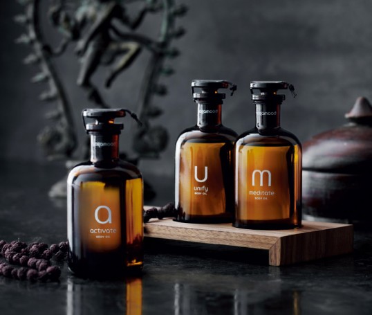
“A newly established yoga studio, Yogamood seeks to place yoga in a modern Scandinavian context, making it accessible to those without prior knowledge of yoga while retaining the philosophy’s unique ideology and symbolism. Following the establishment of the company, Yogamood developed a range of pure aromatherapy oils. Each has its own characteristics and application and can be used separately. When all three oils are placed in a row, the product names A (Activate), U (Unify) and M (Meditate) form the word AUM, an meaningful and well-known term in yoga philosophy.”
All of this aromatherapy branding works really well across a variety of mediums. This is exactly what I need to create and I need to ensure that whatever it is that I design, it must be typographically focused.

I love the simplicity of this packaging. It is completely typographic and works really well. Initially I had considered creating packaging which was quite illustrative, however I may find that type alone works well enough.

This on the other hand is very colourful and illustrative. This wouldn't work for the packaging I would like to produce as well as the branding, as I would like to make it a little bit more simple than this.

Source
Something as simple as this would work really well for my branding as it is type based and has all of the relevant information about the ingredients printed on there.

Source
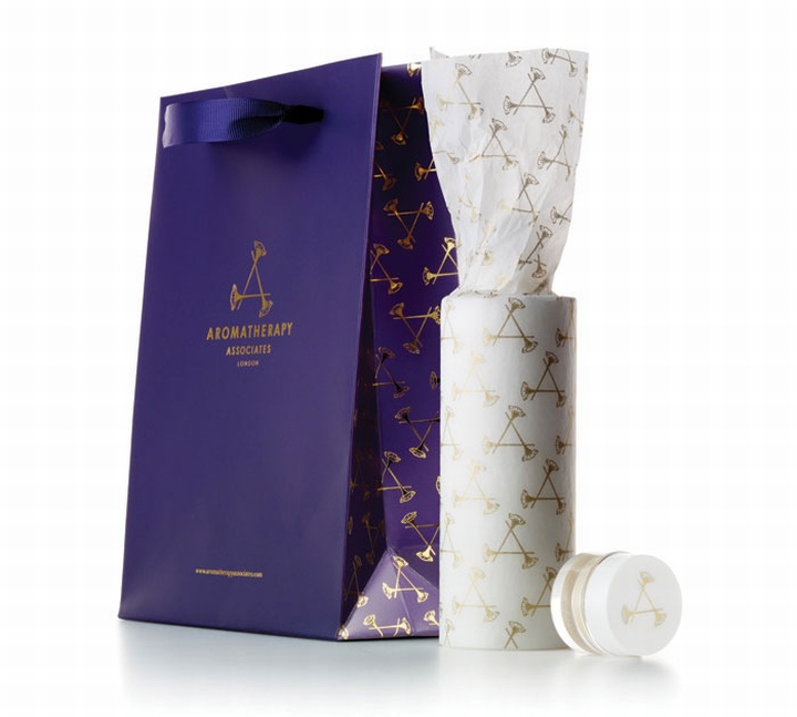
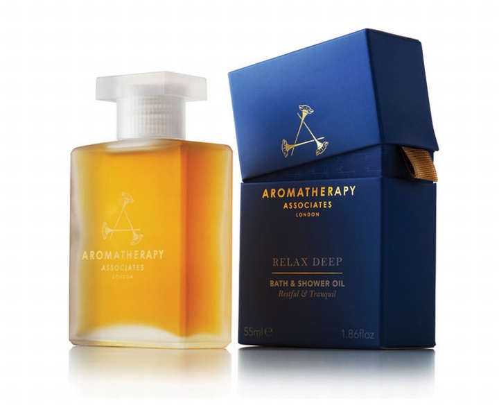
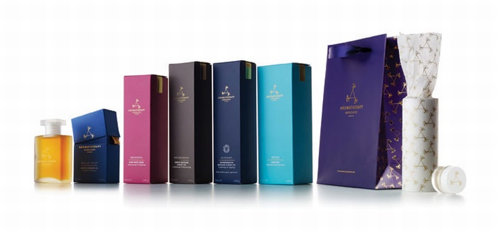
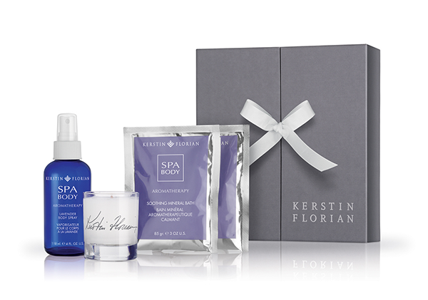
This is a high end example of some aromatherapy packaging. I am not sure whether this would be suitable, because my store is going to be a pop up store and so I don't want the packaging to be overly luxurious and hard to reproduce.
No comments:
Post a Comment