The screenshots below are taken from the Kimberly-Clark website. All of the headings I came up with were inspired by their website, and the content was taken from this source as well, to make it as true to a real life situation as possible. I would like to think that if I was to approach Kimberly-Clark with my idea that they would possibly consider creating it. This is something I am going to consider when it is all photographed professionally.
Saturday, 29 March 2014
Tuesday, 25 March 2014
OUGD503 Responsive - Design Process 2: Tigerprint Primary Research
When I decided that I was going to do the Tigerprint brief I thought it would be worthwhile to go into Marks and Spencer and take some photographs for primary research. I wanted to look at existing products to make sure that what I design is different and will stand out.
OUGD505 - Design Practice 2: Studio Brief 2 (Costing)
As I only have a limited amount of time to complete this brief, I need to get myself as organised as possible. I only really have the period of time over the Easter break to finish all of my work and get it ready for my stall at Waterstones. Today I carried out some research online for all of the different bits and pieces I will need. I want to try and keep the cost down as I have already spent a lot on the production of the box as well as the paint.
I researched into different types of buckles that are available to buy online, considering delivery time and where they are coming from. The first two examples below demonstrate buckles which are available but they are either too big or will take too long to arrive.
I have decided that I am going to order the buckles listed below. They are the cheapest option and they will arrive as soon as possible. They are also an ideal size because I don't want them to be too large. This size is ideal for me to use to hold all of the flash cards together securely.
I have also researched into webbing further, to see whether I can find anything more appropriate to the webbing I found in Homebase. However, I have decided now that I am going to use the webbing I found in Homebase because I know that it is high quality and readily available rather than waiting for it to arrive in the post.
I also came across these wheels online and think they would work really well as a part of my road safety collection. Although at the moment I am not sure what I will use these for, other than perhaps attaching them to my keyrings, I am sure that I will find a use when they arrive. Or alternatively, I could ask for some feedback in a crit and see if anyone has any useful suggestions.
Sunday, 23 March 2014
OUGD505 - Design Practice 2: Studio Brief 2 (Primary Research)
When I was in college today, i noticed that there was a wheel on the wall. I wanted to take photographs to document this design, as this is something which I have considered creating for my road safety work for studio brief 2. This is because, if I create something in the shape of a wheel (taking the form of a car wheel) then it would link closely to my topic and it would also engage autistic children straight away, as they tend to love the sensory properties of products. I am not sure whether I am going to go ahead with this idea. I did initially think that I would perhaps create an interactive publication with a wheel revealing certain pieces of information one at a time, but ideally if I was to create this, I would like it to also have noises accompanying the text (so there would be buttons to interact with as well).
Tuesday, 18 March 2014
OUGD503 Responsive: Design Process 2: Voodou Hairdresser (Visual Research)
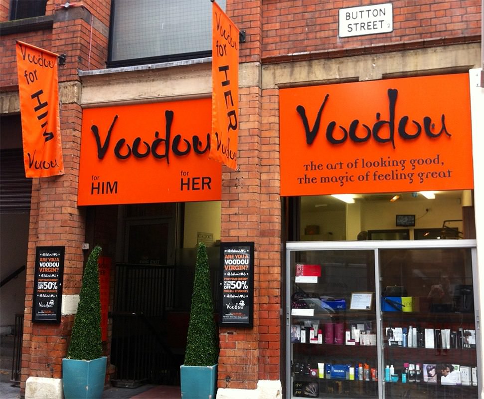
I have created this post so that I can document any helpful imagery which I may come across when completing any work for Voodou hairdressers. I feel as though the more imagery I have, the more likely I am to be able to produce some work which is strongly representative of their business.
I have walked past several of their salons before, as they are all in Liverpool and this isn't far from where I live when I'm at home. I have also found some photographs online of some of their salons which I am finding helpful, as I can look at their font choices and how they have presented themselves.


When I did a basic search for 'Voodou Liverpool' images of their staff came up, which shows that they want to be perceived as a friendly organisation and a business which clients feel they can approach easily. I got this impression when I visited the salon and had a meeting with the marketing manager, and also realised this when I designed some promotional material for them over Summer.
Voodou Website
I have also researched into the Voodou website as I think it is important to understand their online presence as well. Interestingly, since the Summer, I have noticed that they have used my illustrations on the banner along the top of the home page. This is something we hadn't agreed on when I did the work for them, however I don't mind because it shows that they were happy with the outcome.

Friday, 14 March 2014
OUGD503 Responsive - Design Process 2: Tigerprint Secondary Research
I decided to carry out some research online as well as in the store. I think this is important because often they don't have the same stock in store as they do online and I need to look at a wide variety of designs. I also wanted to look to see whether there are any noticeable trends running throughout the patterns. Coming up with something different is probably going to be the hardest part, but I am looking forward to the developmental process and seeing what I can come up with, as this is a brief which is very different to any I have worked on previously.
I have chosen a few male and female designs here, and feel as though they all differ quite a lot in terms of style. Depending on the target audience, the pattern can change dramatically, so it is important that when I decide whether to design for the male or female population, that I determine what kind of message I want to portray through my work.
Sunday, 9 March 2014
OUGD503 Responsive - Design Process 2: Packaging Research
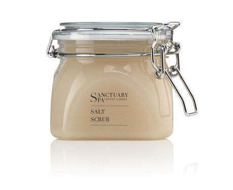
As we are now at a stage in our development where we can decide on the packaging of our products I thought it would be useful to do some research into some different containers. I have had the idea of making our products relate to alcohol subtly. This would be achieved by using bottles which have a closure that 'pops' open in the same way as an alcoholic beverage, and also, the overall effect could be created by placing all of the items/products in a container which looks like a crate of alcohol. This would make the packaging appeal to a younger audience, which is what we are aiming for.


Subscribe to:
Posts (Atom)


