Find 5 images of Modernist graphic design and 5 images of postmodernist graphic design. Write a short critical analysis of each image, which focuses on:
a) Why you consider each image to be Modernist / Postmodernist
b) Whether you think that the image is successful or unsuccessful
c) Relate your analysis to the terminology introduced in the session
d) Use at least one quote from the essay by Massimo Vignelli to back up your analysis
MODERNIST
Herbert Bayer: Typeface
Herbert Bayer's 1925 'universal' typeface was a typeface designed in a single case form. Modernism is all about internationalism which is why he wanted this font to be recognised worldwide. There was no need for serifs as everything was minimalistic and simplistic. Functionality is key, there would be no need to design a typeface in both upper and lower case because people pronounce words all the same regardless.
'Modernism was never a style, but an attitude.'
Long Live Modernism, Massimo Vignelli
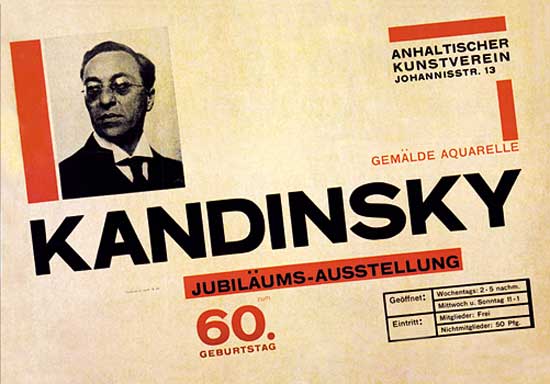
Herbert
Bayer's poster for Kandinsky's 60th Birthday
This poster is distinctive because of it's simplistic design. It is well structured and is straight to the point. It very clearly portrays the modernist trait of using a grid to create a well structured layout. The colours used complement each other well and I it is successful in terms of portraying a message clearly. The use of photography also indicates development in technology at the time and how designers were proud of what they could achieve.
'Modernism was a commitment against greed...'
Long Live Modernism, Massimo Vignelli
'Modernism was a commitment against greed...'
Long Live Modernism, Massimo Vignelli
Modernist designs focus on clarity and purpose. Form follows function and the graphic design doesn't need to be overcomplicated. This design is very obviously modernist as it uses block shapes and bold statement colours. Together, this forms a powerful image with no need for embellishments or added details. This design would still look fresh and powerful today.
'Modernism's inherent notion of timeless values as opposed to transient values still greatly appeals to my intellectual being.'
Long Live Modernism, Massimo Vignelli

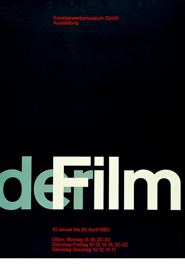
Josef Muller-Brockmann
This poster is modernist as it is legible, minimalistic and straight to the point. There is clearly evidence of a grid system being used as the composition of the red typography is aligned at the top and bottom whilst the bold sans serif font is used for the subject matter. The grid systems were used as a way of logically organising information and it is quite obvious that this was a valuable movement in modernist graphic design as we still use grids today in both print and web design.
'The revision of many of the Modernist issues have enriched our perception and have contributed to improving the quality of work.'
Long Live Modernism, Massimo Vignelli
'Modernism's inherent notion of timeless values as opposed to transient values still greatly appeals to my intellectual being.'
Long Live Modernism, Massimo Vignelli
Example 3
. . . . . . . . . . . . . . . . . . . . . . . . . . . . . . . . . . .

Example 4
. . . . . . . . . . . . . . . . . . . . . . . . . . . . . . . . . . .
Josef Muller-Brockmann
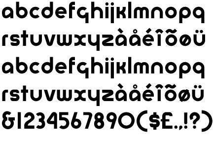
Grotezk is a sans serif font which was used in modernist work. It is very similar to Helvetica and was very popular because it is legible and well suited to every area of graphic design. The text is portrayed in the three most widely spoken languages of the world, making it universal. It is perfectly aligned and easy to follow. There was no real need to incorporate colour to this design as it would be seen as unnecessary. This is therefore a prime example of a stripped back piece of modernist graphic design which creates a fresh and modern look easy for everyone to follow.
'The cultural energy of the Modern movement is still burning...'
Long Live Modernism, Massimo Vignelli
Example 4
. . . . . . . . . . . . . . . . . . . . . . . . . . . . . . . . . . .
Josef Muller-Brockmann
This poster is modernist as it is legible, minimalistic and straight to the point. There is clearly evidence of a grid system being used as the composition of the red typography is aligned at the top and bottom whilst the bold sans serif font is used for the subject matter. The grid systems were used as a way of logically organising information and it is quite obvious that this was a valuable movement in modernist graphic design as we still use grids today in both print and web design.
'The revision of many of the Modernist issues have enriched our perception and have contributed to improving the quality of work.'
Long Live Modernism, Massimo Vignelli
. . . . . . . . . . . . . . . . . . . . . . . . . . . . . . . . . . .
POST-MODERNIST
Neville Brody: The Face Spread
Neville Brody was the art director of the magazine called 'The Face' from 1981-1986 and he was extremely influential at the time to designers worldwide. His typographical style was unique and very obviously post-modernist. In post-modernist art the design itself meant more than the content, so the form follows the function. This is very true in this case as much of the text is lost due to the busy and colourful design. It creates a clashing aesthetic feel whereby the meaning behind the article is almost completely lost.
'The followers of the Post-modernist fad are gone, reduced to caricatures of the recent past.'
Long Live Modernism, Massimo Vignelli

David Carson: Ray Gun Spread
The website where this was found said that David Carson had actually replaced a feature about Bryan Ferry the singer with two columns of unreadable dingbats. This reflects the post-modernist style as it indicates the fact that legibility wasn't important. So much so that the the text was printed in full at the back of the magazine for the people who wanted to know what it said. This is an inconvenience for the reader however it didn't matter as long as it was 'aesthetically pleasing' and stylish.
'We still have too much trash around us, not only material trash, but intellectual trash as well.'
Long Live Modernism, Massimo Vignelli
. . . . . . . . . . . . . . . . . . . . . . . . . . . . . . . . . . .
Rick Poyner
This speaks for itself in many ways. Ironically the front cover of this book is fairly minimal and simplistic, not far off a modernist design. However the words themselves 'no more rules' sum post-modernism up in a nutshell. Post-modernist artists rebelled against anything modernist artists believed in. They could do whatever they wanted without following a certain structure. Serif fonts were used for added decorative and visual purposes and as indicated by the back of the book, the busier the image the better.
'As a designer, I have the responsibility to improve the world around us, to make it a better place to live, to fight and oppose trivia, itsch, and all forms of subculture which are visually polluting our world.'
Long Live Modernism, Massimo Vignelli

. . . . . . . . . . . . . . . . . . . . . . . . . . . . . . . . . . .
Poster for a lecture by Kenneth Hiebert
This very clearly shows how style is seen as being more important than the content itself. The important information provided about the lecture is printed in tiny print while the designers name is the prominent piece of typography. Legibility is therefore very poor and it is obvious that more time has been spent on the design of the poster rather than the content.
'The solutions should reflect the approach taken...'
Long Live Modernism, Massimo Vignelli

. . . . . . . . . . . . . . . . . . . . . . . . . . . . . . . . . . .
Jeffery Keedy Emigre Type Specimen Series
This is clearly a post-modernist piece of graphic design. There is no real structure to it and it is hard to actually know what the purpose behind the design is. The range of typeface sizes along with the continual use of lines underneath and overlaying the text makes it hard to read, this shows how function follows form. Modernist art would be much more easy to follow however the designer has gone out of their way to make it as far from modernist as possible.
'Modernism was a commitment against greed, commercialisation, exploitation, vulgarisation, cheapness.'
Long Live Modernism, Massimo Vignelli
No comments:
Post a Comment